
The relationship between images and words has a long tradition that began with the ancient manuscripts, but since the beginning of the 20th century, with the artistic avant-garde, the textual component recovers a high weight as it becomes an object of analysis and (dis)construction. Braque and Picasso, promoters of Cubism, incorporated words into their paintings using newspaper. Likewise, Boccioni and Marinetti’s futurism violently altered the size of the typography within the same word, an aesthetic similar to Russian constructivism, which marked the path for graphic design. Dada poetry was a massive revolution. It’s writing was constructed by selecting words at random from different books that later directly influenced the automatic thinking that the surrealists carried out to represent the world of dreams and the unconscious.
Today, the boundaries between art, advertising, design or communication are becoming increasingly blurred. From the ashes of the avant-gardes came many artists who use words as their great weapon to convey messages, in some cases, interesting ones, which expose the undoubted power of words. Below are some of the artists who have captivated attention with their work in a variety of ways.

Joseph Kosuth
Kosuth is one of the pioneers of conceptual art that emerged in the 60s and 70s. His work is based on the dematerialization of art; in other words, the artist rejects the notion of the work of art as a contemplative object. Kosuth followed in Duchamp’s ready-made footsteps and became interested in the objectivity of closed concepts; that is that they are imposed on immediate reality, and words are the perfect medium since definitions are usually concrete and concise. In this way, in his works, the artist eliminates everything with a subjective character, and that depends on the spectator’s multi-interpretations to reduce it to a single idea.
His work, “The Colour of Wittgenstein,” is based only on RED’s word, whose relationship to its meaning is literal. In the case of “One and Three Chairs,” in which he contrasts a chair with his photograph and its definition, which also does not admit of variations. The importance of Kosuth’s artistic work lies in the combination of the words and the installation to reflect on the effects of language on the subjects’ subjectivity.
Matt Siber
Matt Siber’s work is characterized by the intervention on urban photographs where the focus is on traffic signs, advertising posters on the roads, or the most influential capitalist consumerism brands. Using Photoshop, he eliminates the support structures of these objects so that the logos are left floating. Using this action, the artist removes all visual distractions to only pay attention to the text or the logo. Siber’sOn the other hand, the “Untitled Project” is based on the deliberate absence of text. Both works are intended to explore the power of human words concerning public language and point out the many non-traditional ways in which written language is used to communicate.
Jason Innocent
Innocent is an emerging artist who demonstrates his social commitment in his work. He transmits a powerful message to his viewers in which he denounces different current social problems such as racism, inequalities and gender stereotypes through satire. In his first works, he juxtaposes drawing and writing of a childish nature that denotes spontaneity. Many of his words may be upside down, crossed out, or joined together in a Scrabble-like manner. However, he began to gain recognition on the art scene for his graffiti and stencils in lower Manhattan with a mixture of drawings, phrases, words, poetry, and lines such as his intervention in public space anti-Trump posters during his election campaign.
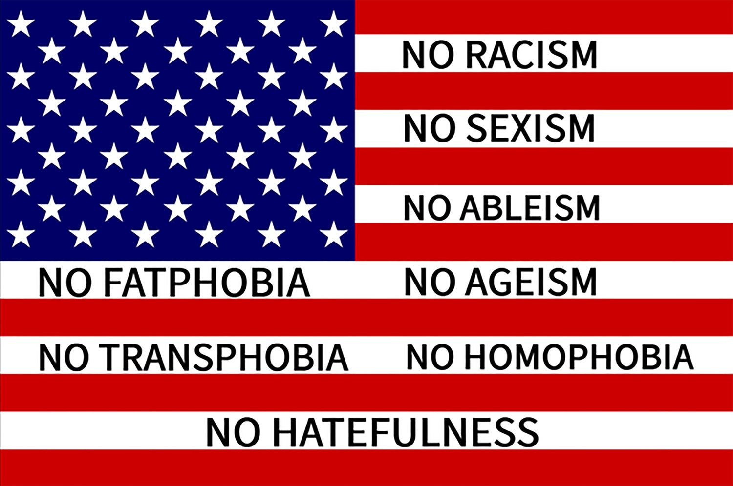
Jason Innocent also combines using graphic language. “American Flag” is a work in which he disarms and re-signifies the concept of the American flag and questions what it represents for citizens by creating a banner with the compelling words NO RACISM, NO SEXISM, NO ABLEISM, NO FATPHOBIA, NO AGEISM, NO TRANSPHOBIA, NO HOMOPHOBIA, AND NO HATEFULNESS. Following a similar line, the artist has recently created minimalist images with the words HOLY SHIT, RADIO RADIO, and Burning the midnight oil in which Innocent appeals to the literalness of their definitions. In the case of Holy Shit, he emphasizes its meaning with the use of capital letters, and in RADIO RADIO, he uses the resource of repetition.
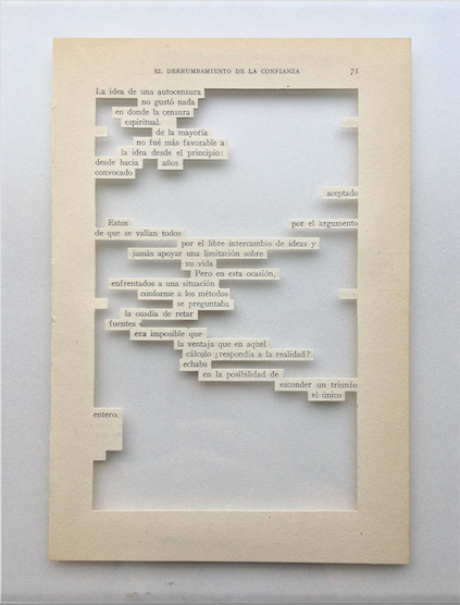
Mar Arza
Mar Arza is a sculptor of words. Through non-writing, she manipulates the original stories in search of an artistic lyricism. Under the influence of Dadaist poetry, she chooses words at random from books’ pages and then meticulously dissects texts and phrases or emphasizes concepts that take on a sculptural form without frames or crystals. Her works destroy the hegemonic account of the idea of linearity and challenge the limits of the structure and easel painting concept. Arza adopts a disruptive attitude towards the idea of reading both books and contemporary art. In this way, the artist integrates a debate about words and their tangible dimension and explores new conceptual, verbal, and plastic meanings.
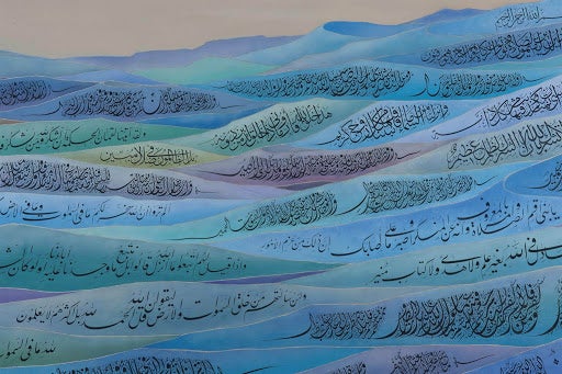
Honda Koichi
Koichi is a master of Arabic calligraphy despite being Japanese. He belongs to a small community of Japanese who practice Islam’s religion, which originated during World War II. Koichi is an interesting example of interculturality and the construction of cultural stereotypes. His work forces us to reflect on the notion of culture and identity and ask ourselves: why do we find it so shocking to see a Japanese Muslim, a Japanese master of Arabic calligraphy? Also, Koichi incorporates the Arabic characters as a graphic element, paying attention to their delineation and form. His well-known blue pyramid work is built with verses from the Koran and at the top; you can read Allah’s name, the Muslim God, surrounded by a white aura.
Barbara Kruger
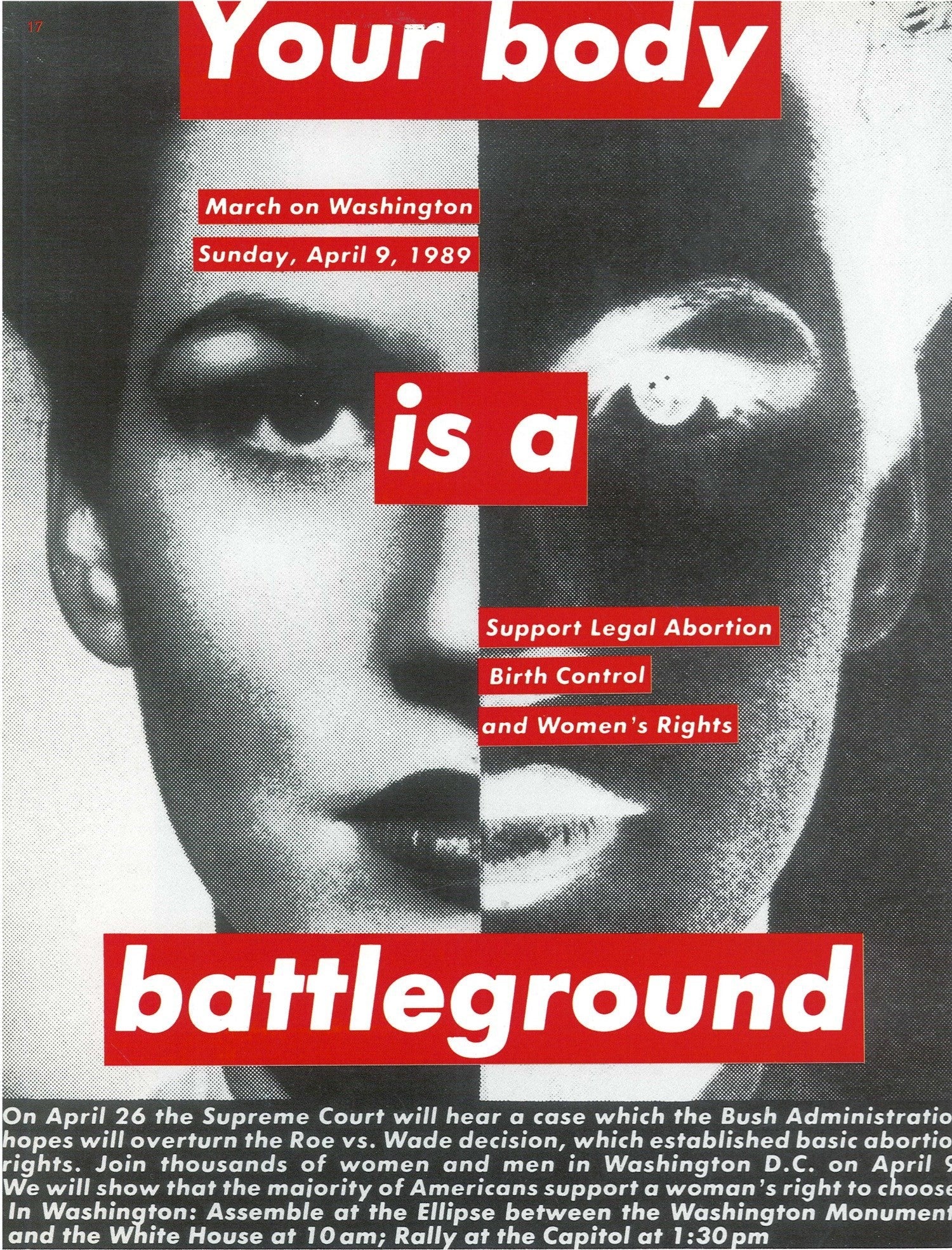
Barbara Kruger is a pop artist working out of New York and Los Angeles. Her career began in the late 60s, doing mixed media work that often included sewn yarn, beads, and other common craft materials, turning them into sexually suggestive pieces. This was at the height of the discussion around the lines between art and craft. By 1976, she took a sabbatical from her practice. It wasn’t until she discovered the philosophical works of Walter Benjamin and Roland Barthes that she became reinvigorated, picking up collage as her new focus. She gradually expanded into other fields, making everything from installations to t-shirts.
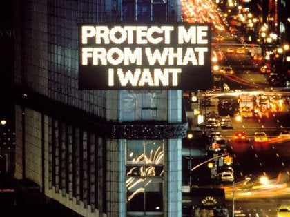
She is most well known for her pieces featuring found black-and-white photography overlaid with text, typically in Futura and Helvetica. Using the motifs of magazine and billboard advertisements, Kruger is a master at subverting context. One of her most well-known statements, “I shop therefore I am,” highlights her frequent confrontation with consumerism and the self’s examination in late capitalism. Similar works include text like, “You are not yourself,” and “Where does she think she is?” These provocative phrases are most famously set in white text on red strips, charging the images with conflicting messages and darkly humorous references.
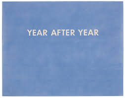
Jenny Holzer
Jenny Holzer’s career is defined by text and finding new ways to display it to the public. The first phase of her work was a series called Truisms, a two-year project beginning in 1977. She clipped moving quotes from the Whitley Independent Study Program and reproduced them in italicized black text on broadsheet paper. The effect is an extensive list of quotations that dazzle the eye until approached and read carefully. Phrases as disparate as “CAPITALISM IS AS ARTIFICIAL AS PLASTIC” and “EVERYTHING THAT IS INTERESTING IS NEW” live in succession, dozens lined up one after the other. These broadsheets were wheat-pasted in public areas around Manhattan, including businesses and open fences. Over the project’s course, she printed the quotes on leaflets, t-shirts, and other materials.
As Holzer’s profile increased, she began pursuing new avenues to project language into the world. She has expected declassified government documents on a New York Library building, displayed quotations on electronic airport signs, and installed stone benches engraved with quotes from the Hollywood Ten victims at a public park. This small selection highlights the full range of her oeuvre, which continues five decades.
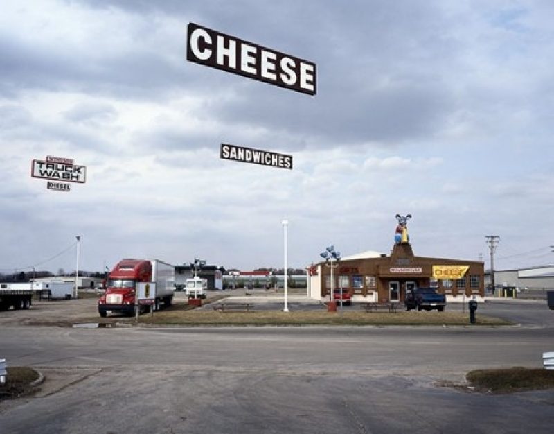
Ed Ruscha
Ed Ruscha’s career is defined by the ethic of pursuing high art through commercial forms. This proclivity propelled Ruscha into the forefront of the emerging pop art movement in 1969, when he participated in the seminal show “New Painting of Common Objects.” His biography shows why he had the unique ability to merge these fields. After receiving an art education from Emerson Woelffer and Robert Irwin at the Chouinard Art Institute, Ruscha found employment as a layout designer at the Carson-Roberts Advertising Agency. Over the 60s, Ruscha had rigorous training in the art of print publication and used this to change the landscape of 20th-century art along with fellow travelers like Andy Warhol and Roy Lichtenstein.
Ruscha’s work explores typography and manipulating letter shapes, using typefaces like found objects, sometimes choosing words not for meaning but visual interest. His paintings often feature text in the world, famously gas station signs. In these, he is like a landscape artist who captures typeface in the wild. While also experimenting in photography and filmmaking, his lasting legacy is his work with text and his position as a luminary of pop art.
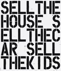
Christopher Wool
Christopher Wool is a contemporary artist who works in the text through a post-conceptual lens — a movement that seeks to place all aesthetic choices into the service of ideas. He lives and works in New York but spends much of the year in the storied artist and writer getaway of Marfa, Texas. His atypical art education helped shape is atypical approach. While he enrolled at the New York Studio School in the late 70s, he left shortly after, with most of his formal training from his role as a studio assistant for sculptor Joel Shapiro. Instead, he soaked up the thriving art and music scene in the city. Wool began working with text in the 80s, finding his signature look of stenciled black letters placed in a grid pattern over a white background.
Wool often repeats words, drops vowels, and rearranges or eliminates spaces. The outcome is striking, often creating a challenge for viewers to grasp what is written quickly. This lingering effect of his work forces viewers to stand and struggle through each letter, muttering the sounds under their breath, reengaging with the very act of putting notes together to create a meaningful word. The outcomes are often humorous and forceful. The confrontational messages antagonize the slow work of reading.
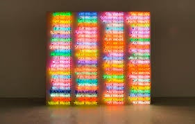
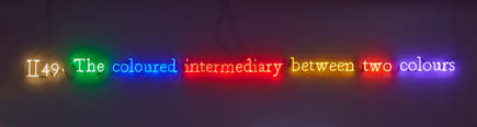
Bruce Nauman
Bruce Nauman is an artist who has worked in every conceivable physical medium. His career has frequently, though not exclusively, played with text, often written in neon light. He began his education pursuing mathematics before studying art at the University of California, Davis, from 1965 to 66. While his art started with painting, he was seeking cinema, performance, and sculpture before long. That opening up of his pursuits led to the wide variation he experimented with over his career.
His resplendent neon works are halting studies in the use of text in art, using multiple bright colors and bizarre layouts, these pieces send viewers turning their heads, stepping back, and stepping forward. In some parts, phrases careen into each other and break at angles in the collision. In others, words spiral out from or into the center. Nauman’s playful approach brings optimism to the existential themes of psychology, sexuality, and the pursuit of art.