
After years of playing it safe with neutral decor, Canadians are getting bolder with colour, and this will translate into more expressive-looking homes in the year ahead.
That’s the forecast of leading paint brands Sico and Dulux in unveiling their top colour picks for 2027. From rich brown, to teal, berry red, olive green and muted pink, next year’s palette is filled with saturated, energetic organic hues.
“These pigment-infused earthy colours are joyful, comforting, warm and enduring, delivering stability and emotional nourishment that people are craving amid world pressures and digital fatigue,” said Oriana Gagnon Martinez, Marketing Manager of the Sico brand.
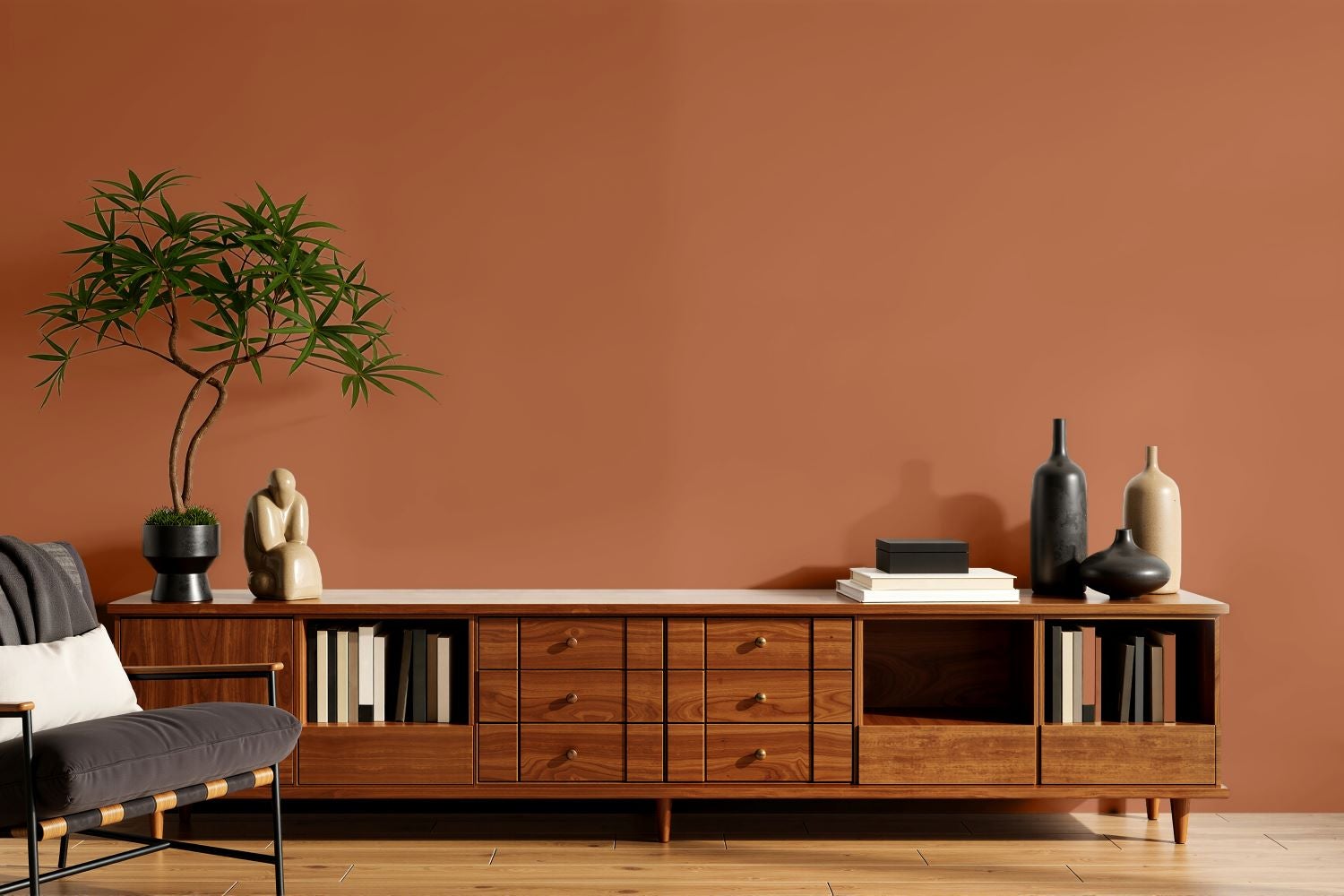
The hottest colours of them all will be rich terracotta brown and pale dusty rose, according to the brands. Sico, for example, has announced Glazed Earth (6066-84) as the brand’s 2027 Colour of the Year, while Dulux has named Birthday Cake (DLX1059-2) as its star colour for the year ahead.
Sico’s Glazed Earth is reminiscent of sunbaked earth and rustic clay, steeped with hints of dusty red and orange that emits a cozy, resilient and timeless feel.
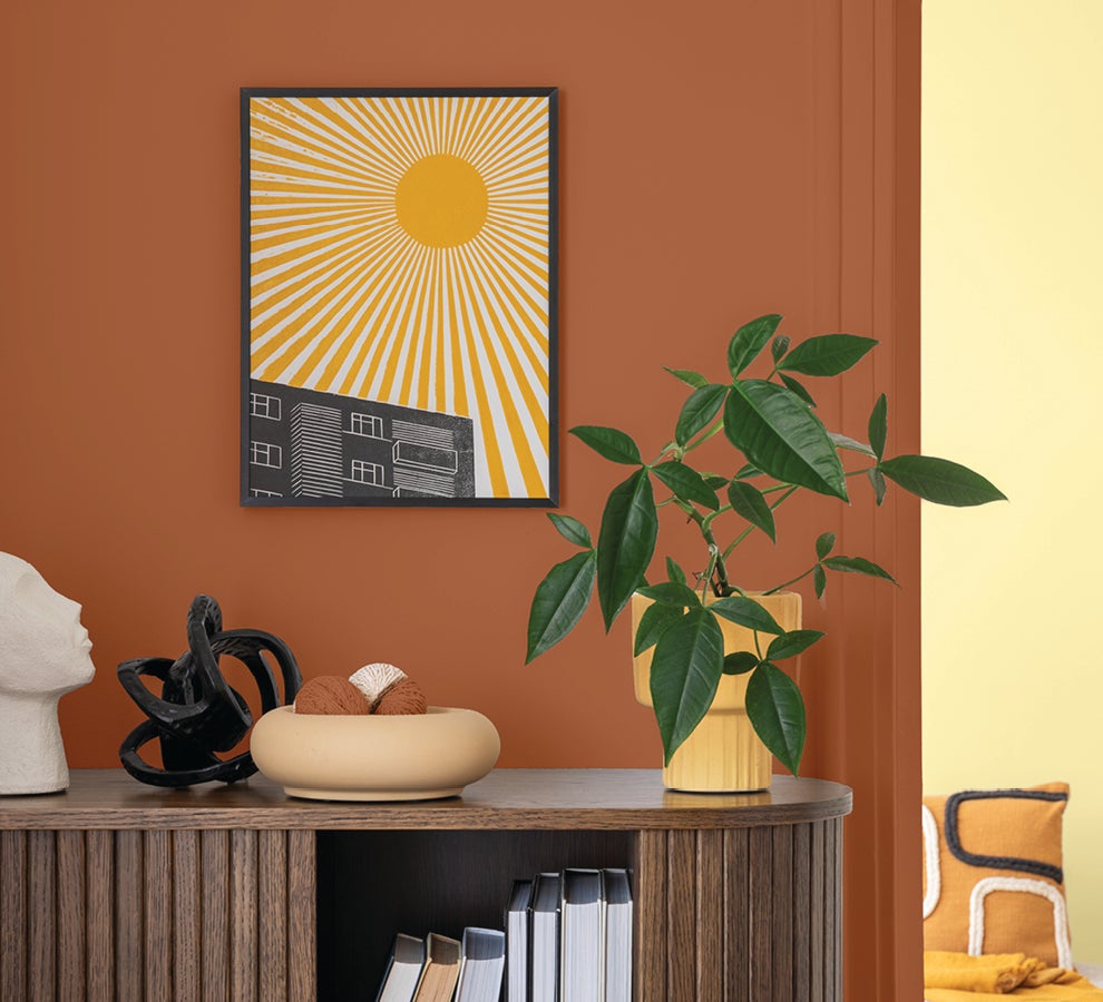
“Terracotta is subdued and nurturing rather than loud, reminiscent of natural elements like soil, stone and pottery,” Gagnon Martinez said. “An uber warm and welcoming neutral, it fills spaces with relaxed elegance that encourages people to slow down, feel grounded and find strength in the reassuring familiarity of home,” she explained.
Dulux’s Birthday Cake is a muted pink tone, resembling soft earthy clay infused with grey-brown undertones that oozes warmth and coziness. This grounded, comforting blush pink adds subtle sophistication and depth to living spaces while emitting a feeling of calm and tranquility.
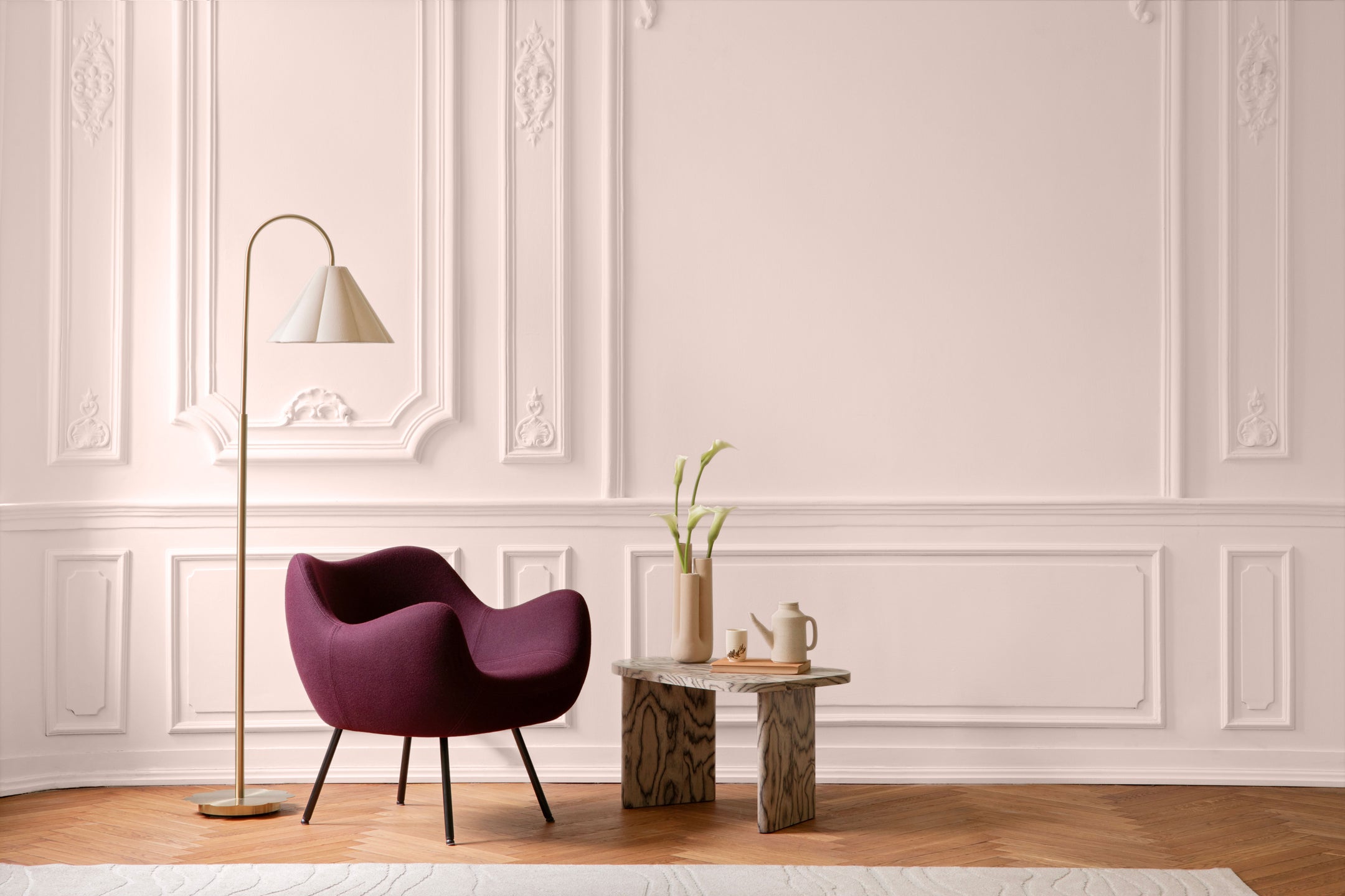
“People today long to rise above the weight of the world and bring more joy into their everyday lives and muted, soothing pink wraps rooms with a sense of optimism, playfulness and emotional well-being that so many of us crave,” said Victoria Mastroianni, Senior Brand Manager for Dulux Paints, likening the trending pink to an uplifting hug.
Incorporated in all elements of home decor in the coming year, from floors, walls and ceilings to furnishings and accessories, these top colours will act as a core design anchor for the rest of the 2027 colour palette, the brands said.
“Rich, saturated colours are redefining what we traditionally think of as neutral shades,” Gagnon Martinez explained. “They provide the same versatility as white, grey or beige, yet add much more depth, personality and warmth to a living space.”
The colours “don’t compete for attention; rather, they have a nature-kissed feel that encourages us to slow down, breathe, rediscover simple everyday pleasures and reconnect with what really matters,” Mastroianni explained.
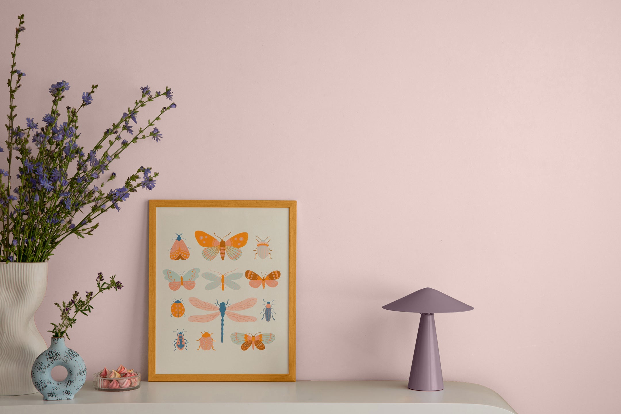
Mastroianni offered these suggestions to make your home look pretty in pink:
- Pair with lights. When painting with dusty rose, ground its softness and make the space feel cohesive by using an equal amount of white, beige, cream or taupe in the room – whether in furniture, fabrics, window coverings or rugs. Particularly hot for the year ahead is mixing matte and high gloss finishes to deliver striking visual contrast and texture.
- Add earthy textures. Combine muted pink walls with organic elements such as wood, terracotta and stone to balance their soft, airy warmth with the rich, heavy textures of natural materials. Wood coffee tables or open shelves, clay tiles or planters, and matte stone tabletops or fireplace surrounds help anchor the room and create a sophisticated rustic sanctuary.
- Mix with metallics. Elevate the soft rosy glow of a blush pink-painted room by introducing metallics in frames, lamp bases, hardware and accent pieces. Dusty pink works particularly well with gold, copper and brass finishes. When decorating, keep metallic pieces to under 20% of the room so that they’re eye-catching without distracting from the soothing vibe of the pink.
- Accent with colour. Dusty pink harmonizes well with a range of earthy shades thanks to its grey-brown undertones. To create a modern look that feels calm and cozy, combine blush pink with warm grey. For an earthy vibe, introduce sage green into the decor, and for a dramatic contemporary feel, use dark accents like charcoal or black.
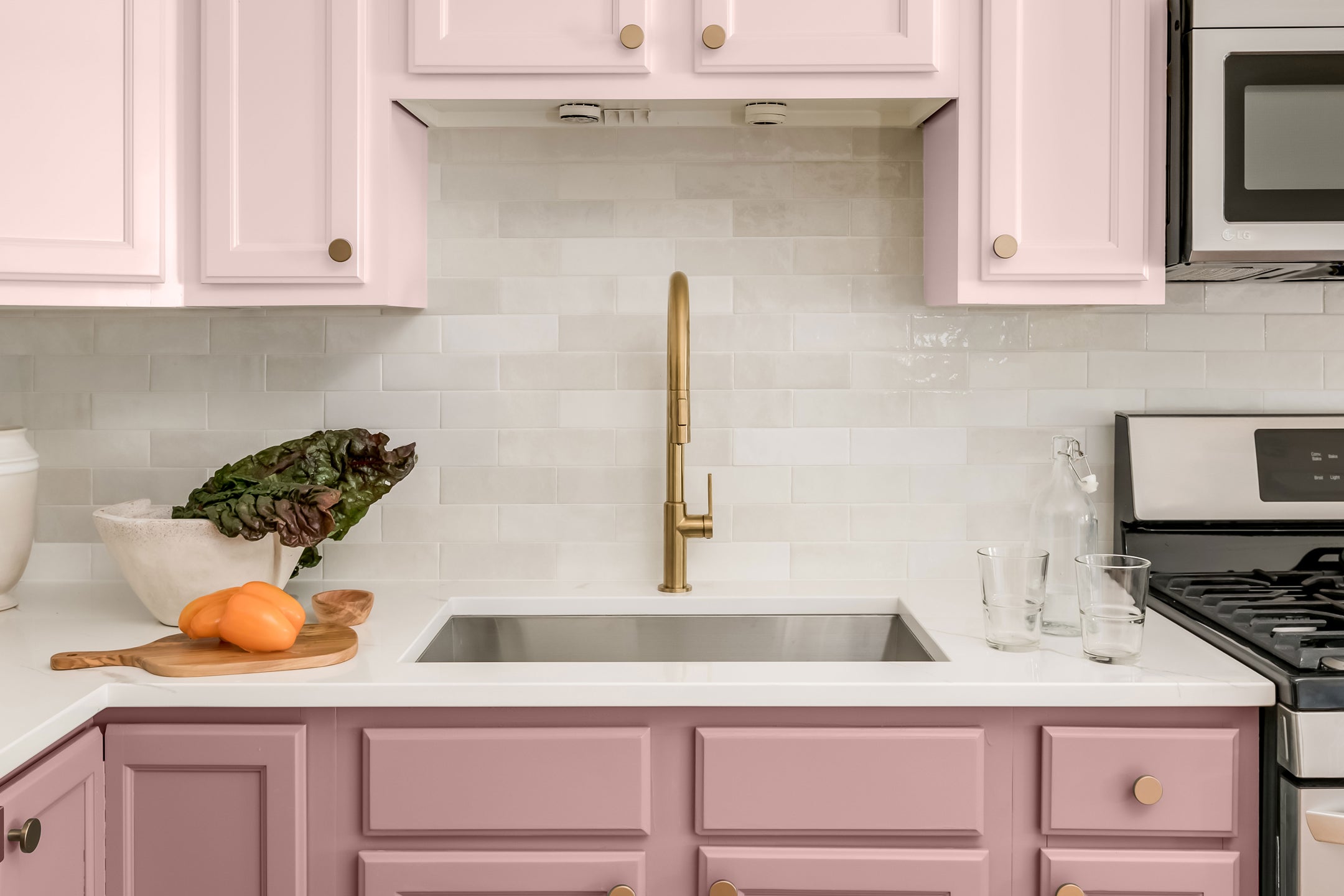
Gagnon Martinez suggested these ideas to incorporate terracotta brown into your decor:
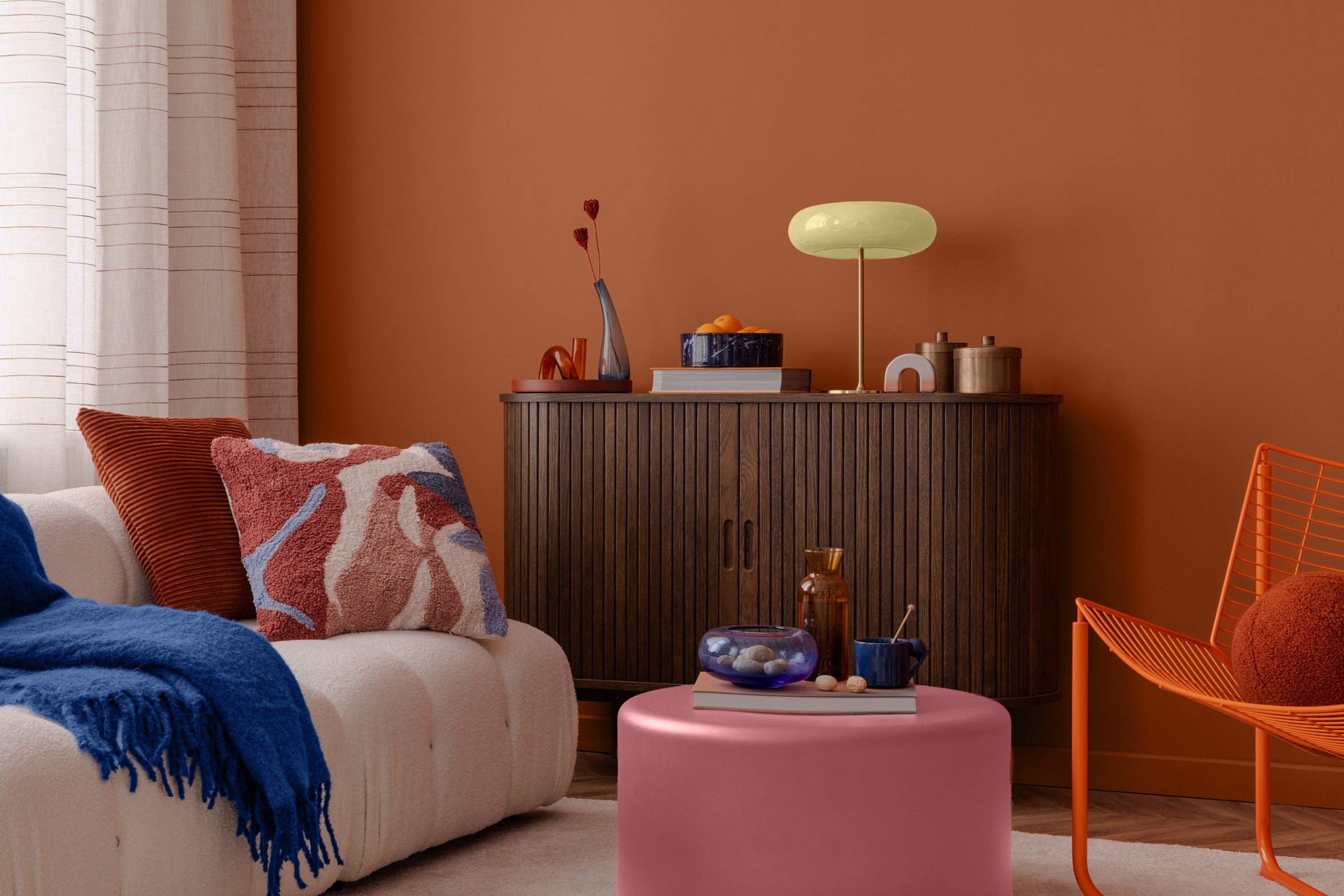
- Use terracotta brown to colour-drench a family room, study, powder room or beroom, unifying the walls, trim, doors, and ceiling to create an intimate and sophisticated cocooning vibe.
- Paint only one area of a room in a vivid colour to create a unique focal point. If the walls of your living room are beige, for example, consider painting the wall behind a fireplace or sofa or the space peeking out from behind an open-back bookcase in terracotta, teal or deep muted blue. Painting a bold-coloured border near the ceiling or floor also adds an eye-catching touch.
- Layer terracotta with other deep browns and burnt reds in furniture and fabrics, and accent the room with gold, bronze or brass lamps, tables, frames and accessories for an elegant look.
- Pair terracotta with warm neutrals such as cream and taupe, earthy greens like olive and sage, or deep contrasting tones such as navy blue or teal. These shades balance the rich, baked-clay warmth of terracotta and keep spaces feeling grounded.